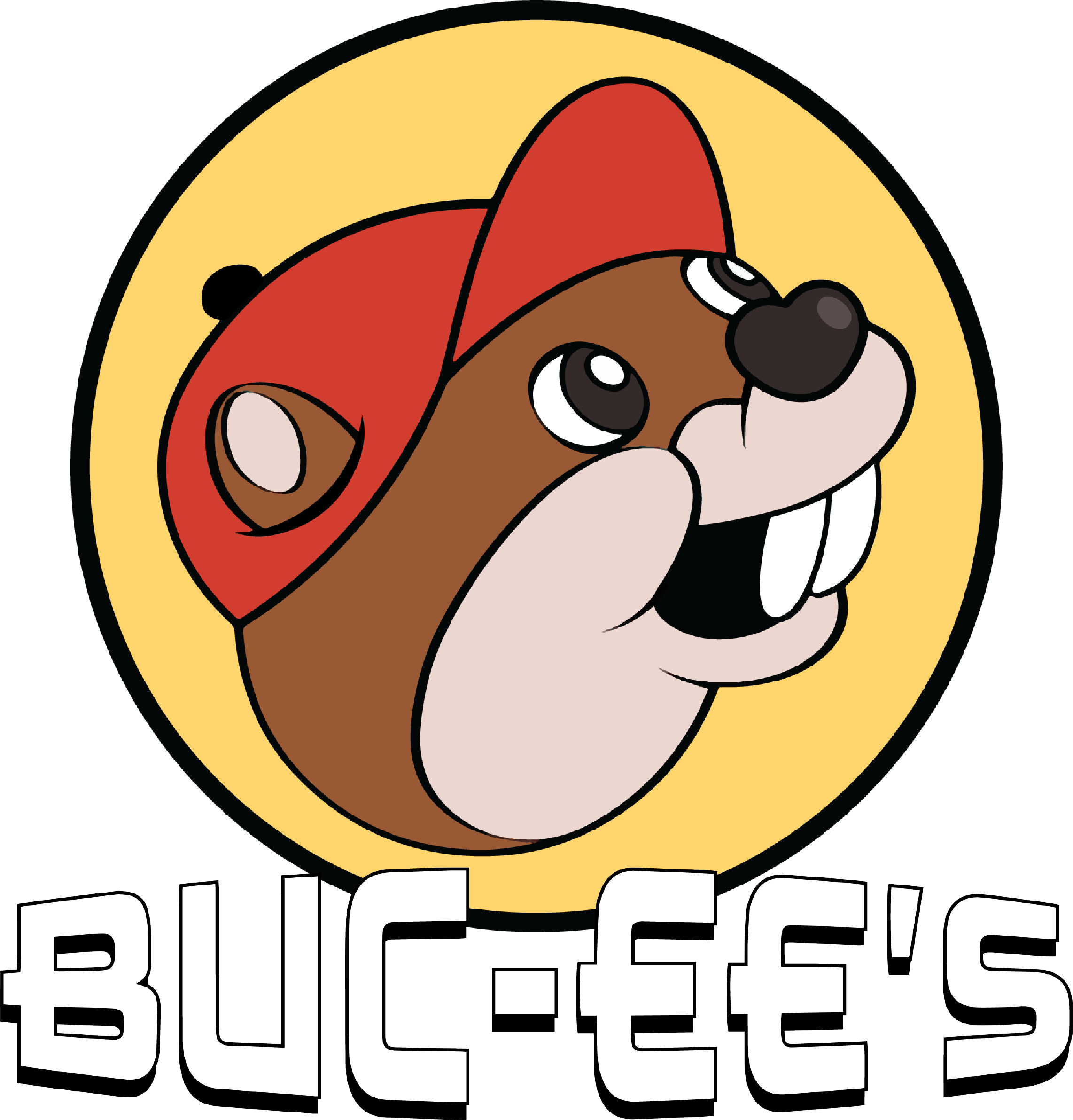
BUC-EE’S HOLDINGS CONVENIENT STORE
Project role: Logo, Rebranding

Living in the South as the expansion of Buc-ee’s gas stations began popping up all over the region, I was able to visit a couple on different road trips with friends. It’s more of a palace than anything else, something like mini Walmart. But something about the beaver head has always weirded me out a bit, so I took the initiative to create a more approachable logo mark

My take on my rebranded version of the Buc-ee’s logo is a more inviting look. I made the colors a bit more smooth, rounded off the corners of the hat, removed the weird heart-shaped tongue from the original and instead made the nose into the heart shape, and modernized the word mark.


